Why does Google look at the phone version of a page first?
Most searches happen on phones, and Google decided some years ago that its index should reflect what those people see. The change is called mobile-first indexing. Googlebot fetches your pages with a smartphone user agent, renders them at a phone's width, and stores that version. Google finished moving sites over in 2024, and since then it crawls almost everything with the phone crawler, so a new site in 2026 has no desktop-first version to fall back on.
In practice this means the phone layout is the page, as far as search is concerned. Text that you hide behind a "desktop only" class, a menu that only appears on wide screens, or images that are swapped out on small screens are judged as they appear on the phone. If the Crumb and Crust price list only showed on desktop, Google would index a menu page without prices.
Responsive design, where one HTML file adapts with CSS, is the simplest way to keep both versions the same. Separate m. sites still work but double the work: every title, description, link and piece of structured data must match on both.
What does the viewport tag do, and what happens without it?
Phones assume, unless told otherwise, that a page was built for a desktop screen roughly 980 pixels wide. They draw it at that width and shrink the result to fit, which leaves tiny text that people have to pinch to read. The viewport meta tag tells the browser to use the device's real width instead, so your CSS can lay the page out for the screen in front of it.
The line goes in the <head> of every page. It is one of the most common things AI-generated templates and hand-copied pages drop, especially on the odd page that was made separately, such as an old About page or a printable price list. The lab reports a missing viewport as an error on every fetched page, because without it nothing else about the phone layout can work.
<head>
  <meta charset="utf-8">
  <meta name="viewport" content="width=device-width, initial-scale=1">
  <title>Menu and prices | Crumb and Crust</title>
</head>
Does page speed affect where a page appears?
Google says its ranking systems use page experience signals, including Core Web Vitals, and also says plainly that relevant, helpful content counts for far more. A fast page with nothing useful on it will not beat a slower page that answers the question. There is no single "speed score" that moves a page up, and a perfect score in a testing tool is no guarantee of anything in results.
The stronger reason to care is people. A visitor on a train with weak signal gives up on a page that shows a blank screen for five seconds, and that visitor was a customer. Speed is part of being useful, and the steps that help visitors are the same ones search engines measure.
The lab cannot measure speed at all, because it has no network and runs no code. It adds up the size of the HTML and the images listed in assets.txt, and warns when a page goes over 1,600 KB. That is a rough stand-in. Real speed depends on the server, the connection, the device, the fonts and the scripts.
What are Core Web Vitals in plain words?
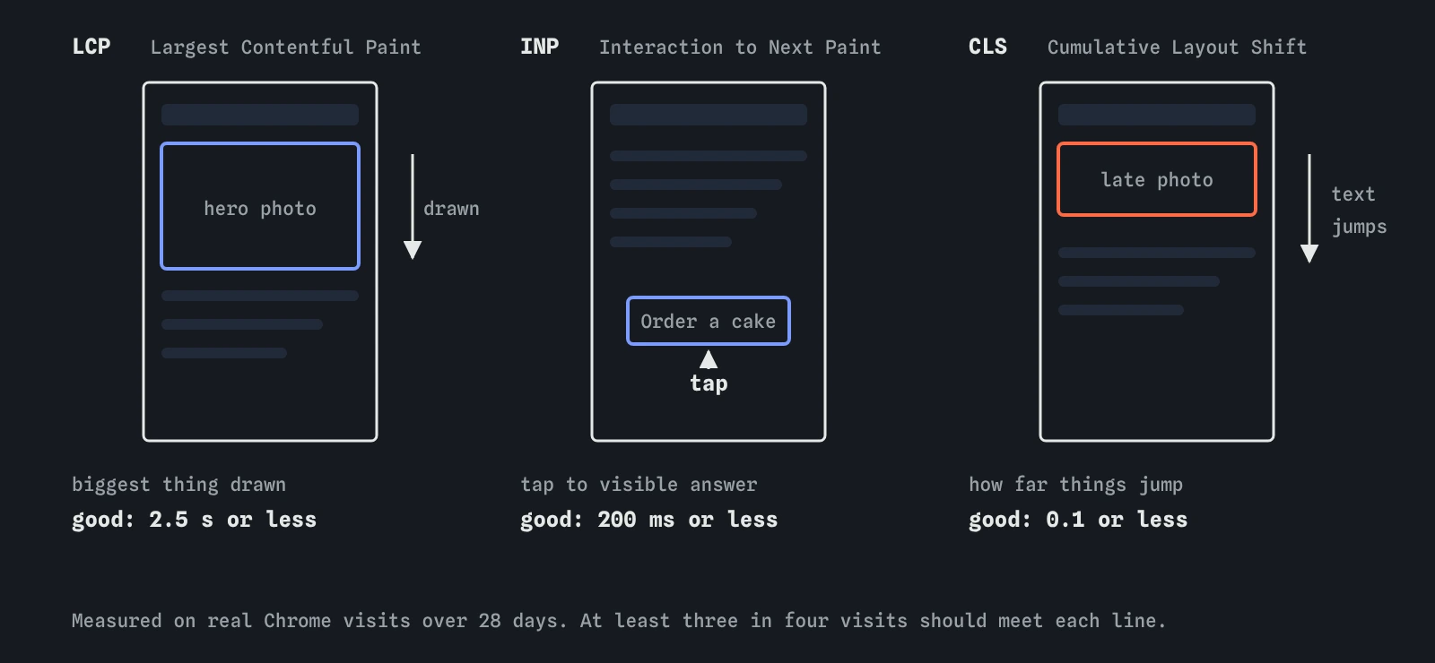
Core Web Vitals are three measurements Google takes from real Chrome users visiting your pages. Each one describes a different kind of frustration, and Google publishes a "good" threshold for each, judged at the 75th percentile of visits, so three in four visits should meet it.
- Largest Contentful Paint (LCP): how long until the biggest thing in view, often a hero photo or a heading, has drawn. Good is 2.5 seconds or less.
- Interaction to Next Paint (INP): how long the page takes to respond visibly after a tap, click or key press. Good is 200 milliseconds or less. INP replaced First Input Delay in March 2024.
- Cumulative Layout Shift (CLS): how much the content jumps around while it loads, such as text shoved down by a late image or banner. Good is 0.1 or less.

Why are images usually the biggest problem on a small site?
On a small business site the HTML is tiny, often under 20 KB. The photos are not. A camera or phone saves pictures several thousand pixels wide, and a 4,000 pixel photo shown in a 1,200 pixel space wastes most of what it downloads. The Crumb and Crust hero photo in the lab is 2,600 KB; a copy resized to 1,200 pixels and saved at sensible quality is 190 KB and looks the same on screen.
Three habits cover most of it. Resize photos to about the largest size they are shown at, and use srcset if you want to offer smaller copies to phones. Save photos as WebP or AVIF, or as JPEG for very old browsers, and keep PNG for logos and line drawings. Give every <img> its width and height, so the browser reserves the space and the text does not jump when the picture arrives.
Add loading="lazy" to images further down the page, so they load only when someone scrolls near them. Leave it off the main image at the top, because lazy-loading the hero delays the very thing LCP measures.
<img src="/hero-1200.jpg"
     srcset="/hero-600.jpg 600w, /hero-1200.jpg 1200w"
     sizes="(max-width: 700px) 100vw, 1200px"
     width="1200" height="800"
     alt="Sourdough loaves cooling on a rack">
Why should crawlers be allowed to fetch CSS and JavaScript?
Google renders a page much as Chrome does, which means it needs the stylesheet and scripts to see the layout. If robots.txt blocks /css/ or /js/, Googlebot gets the HTML without the styles, and it cannot tell whether the page fits a phone screen or whether content appears after a script runs. Old advice to block these folders to "save crawl budget" is still repeated by some tools; it causes more harm than it saves, and small sites have no crawl budget worries anyway.
Keep robots.txt for pages you do not want crawled, such as a basket or a search results page. Let crawlers fetch the files those pages are built from.
How do you check speed and mobile on a real site?
Start with PageSpeed Insights at pagespeed.web.dev. Enter an address and it shows two things: field data from real Chrome users over the last 28 days, if the page gets enough visits, and a lab test run by Lighthouse on a simulated mid-range phone. Field data is what Google uses. The lab score is a diagnosis tool, and it changes from run to run.
In Search Console, the Core Web Vitals report groups your URLs into good, needs improvement and poor, separately for mobile and desktop. A small site may see "Not enough data" for months, which only means too few Chrome users visited to measure. Google retired the separate Mobile-Friendly Test tool in December 2023; Lighthouse in Chrome DevTools covers the same ground, and the device toolbar in DevTools lets you view a page at phone width.
The URL Inspection tool in Search Console shows the HTML Googlebot rendered and a screenshot from the live test, which is the quickest way to confirm the phone version holds everything you expect.
What do AI tools get wrong about speed and mobile?
AI tools tend to treat a Lighthouse score of 100 as the goal and imply it will lift rankings. It will not on its own, and chasing the last few points often means removing things visitors liked. Others still recommend AMP pages for speed or for news carousels; Google dropped the AMP requirement for Top Stories in 2021, and a well-built ordinary page does the job.
Generated templates often leave the viewport tag off pages created later, lazy-load every image including the hero, or forget width and height. Some write robots.txt rules that block script and style folders. And many answers still describe Google as indexing the desktop version, years after mobile-first indexing became the rule. Check the head of every page yourself, and test on an actual phone.
Field notes
- Google indexes the phone version of a page, so content missing on phones is missing from the index.
- The viewport meta tag lets a page fit the phone screen instead of shrinking a desktop layout.
- Core Web Vitals measure loading (LCP), response to input (INP) and layout shift (CLS).
- Large images are the usual slow part of a small site, so resize and compress them.
Easy to get wrong
The hero image is the first thing people see, so lazy-loading it delays the Largest Contentful Paint. Load it straight away, at a sensible size, with its dimensions so the layout does not jump.
Google needs your stylesheets and scripts to render the page as a phone would. Blocking them hides the layout and can make a working page look broken to the crawler.
Google indexes what the phone version shows. Content missing on phones is missing from the index, even if desktop visitors can see it.
Questions people ask
Do I need a separate mobile site?
No. A single responsive site, where CSS adapts the same HTML to each screen, is simpler and is what Google recommends. Separate mobile sites still work but must match the desktop content and links exactly.
My PageSpeed score changes every time I test. Which one is right?
The lab score varies with the test server's load, so treat it as a rough guide. The field data at the top of the report, gathered from real visits over 28 days, is steadier and is what Google uses.
Search Console says there is not enough data for Core Web Vitals. Is something wrong?
No. The report needs a certain number of visits from Chrome users before it can show anything. Small sites often never reach it. Use the lab test in PageSpeed Insights in the meantime.
Does the lab measure how fast my page loads?
No. It adds up the size of the HTML and any images listed in assets.txt. Real loading time depends on the network, server, device and code, which the lab does not have.